Plotting Data
Data plotting and visualisation is handled by the Data sub-class of Stoner.Core.Data.
The purpose of the methods detailed here is to provide quick and convenient ways to plot data rather than providing
publication ready figures. The Data is included as apart of the Data class:
Quick Plots
The Data class is intended to help you make plots that look reasonably good with as little hassle as possible.
In common with many graph plotting programmes, it has a concept of declaring columns of data to be used for ‘x’, ‘y’ axes and
for containing error bars. This is done with the Data.setas attribute (see Marking Columns as Dimensions: the magic setas attribute for full details).
Once this is done, the plotting methods will use these to try to make a sensible plot.:
p.setas="xye"
p.plot()
Data.plot() is simply a wrapper that inspects the available columns and calls either Data.plot_xy() or
Data.plot_xyz() as appropriate. All keyword arguments to Data.plot() are passed on to the actual plotting method.
Each Data instance maintains it’s own matplotlib.pyplot.Figure in the Data.fig attribute, if no
figure is set when the Data.plot() method is called, a new figure will be created.
Types of Plot
Data.plot() will try to make the msot sensible choice of plot depending on which columns you have specified and
the number of axes represetned.
x-y, x-y+-e, x-y-e-y-e etc. data will default to a 2D scatter plot with error bars and call
data.plot)xy()x-y-z data will be converted to a grid and plotted as a 3D surface plot and call
Data.plot_xyz()
- x-y-u-v (i.e. 2D vectro fields) and x-y-u-v-w (3D vectros on a 2D plane) will be plotted as a colour image
where the colour is mapped to hue-saturation-luminescence scale. The hue gives the in plane ange while the luminescene gives the out of plane component of the vector field. These are handdled with
Data.plot_xyuv()
- x-y-z-u-v-w data (i.e. 3D vector field on a 3D grid) is represented as a 3D quiver plot with coloured quivers (using the same H-S-L
colour space mapping as above) assuming mayavi is importable, otherwise using a 3D quiver plot from matplotlib’s 3D toolkit.
Data.plot_xyzuvw()handles the work for this case.
An alternative plot type for data with errorbars in plotutils.errorfill(). This uses a shaded line as an
alternative to the error bars, where the shading of the line varies from intense to transparent the further one
gets from the mean value. For 3D x-y-z plotting there is a Data.contour_xyz() and a Data.image_plot()
methods available. These give contonour plots and 2D colour map plots respectively.
Plotting 2D data
x-y plots are produced by the Data.plot_xy() method:
p.plot_xy(column_x, column_y)
p.plot_xy(column_x, [y1,y2])
p.plot_xy(x,y,'ro')
p.plot_xy(x,[y1,y2],['ro','b-'])
p.plot_xy(x,y,title='My Plot')
p.plot_xy(x,y,figure=2)
p.plot_xy(x,y,plotter=pyplot.semilogy)
The examples above demonstrate several use cases of the Data.plot_xy() method. The first parameter is always
the x column that contains the data, the second is the y-data either as a single column or list of columns.
The third parameter is the style of the plot (lines, points, colours etc) and can either be a list if the y-column data
is a list or a single string. Finally additional parameters can be given to specify a title and to control which figure
is used for the plot. All matplotlib keyword parameters can be specified as additional keyword arguments and are passed
through to the relevant plotting function. The final example illustrates a convenient way to produce log-linear and log-log
plots. By default, Data.plot_xy() uses the pyplot.plot function to produce linear scaler plots. There
are a number of useful plotter functions that will work like this
[
matplotlib.pyplot.semilogx(),:py:func:matplotlib.pyplot.semilogy] These two plotting functions will produce log-linear plots, with semilogx making the x-axes the log one and semilogy the y-axis.[
matplotlib.pyplot.loglog()] Like the semi-log plots, this will produce a log-log plot.[
matplotlib.pyplot.errorbar()] this particularly useful plotting function will draw error bars. The values for the error bars are passed as keyword arguments, xerr or yerr. In standard matplotlib, these can be numpy arrays or constants.Data.plot_xy()extends this by intercepting these arguments and offering some short cuts:p.plot_xy(x,y,plotter=errorbar,yerr='dResistance',xerr=[5,'dTemp+'])
This is equivalent to doing something like:
p.plot_xy(x,y,plotter=errorbar,yerr=p.column('dResistance'),xerr=[p.column(5),p.column('dTemp+')])
If you actually want to pass a constant to the x/yerr keywords you should use a float rather than an integer.
The X and Y axis label will be set from the column headers.
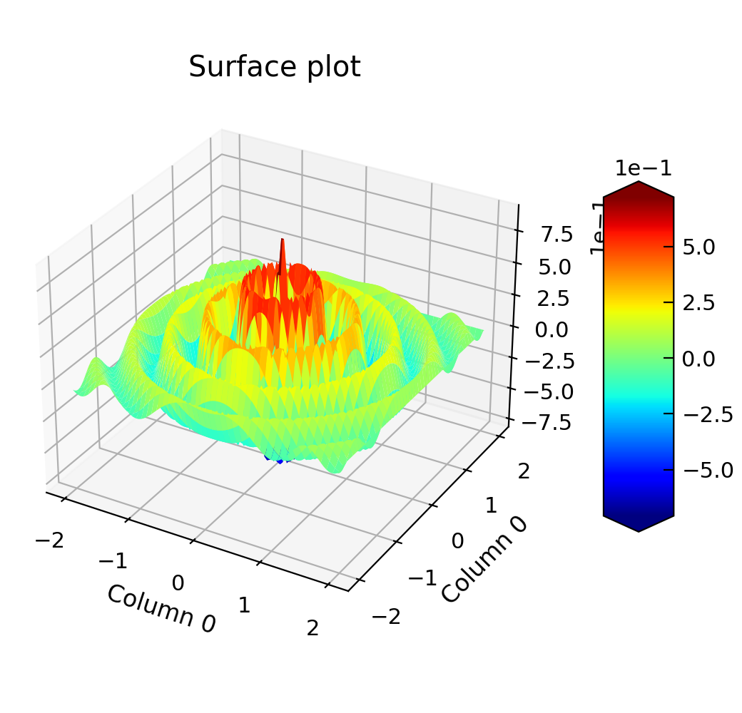
Plotting 3D Data
A number of the measurement rigs will produce data in the form of rows of $x,y,z$ values. Often it is desirable to plot
these on a surface plot or 3D plot. The Data.plot_xyz() method can be used for this.
"""3D surface plot example."""

import matplotlib.cm
import numpy as np

from Stoner import Data

x, y = np.meshgrid(np.linspace(-2, 2, 100), np.linspace(-2, 2, 100))
x = x.ravel()
y = y.ravel()
z = np.cos(4 * np.pi * np.sqrt(x**2 + y**2)) * np.exp(-np.sqrt(x**2 + y**2))

p = Data()
p = p & x & y & z
p.column_headers = ["X", "Y", "Z"]
p.setas = "xyz"

p.plot_xyz(cmap=matplotlib.cm.jet)
p.title = "Surface plot"

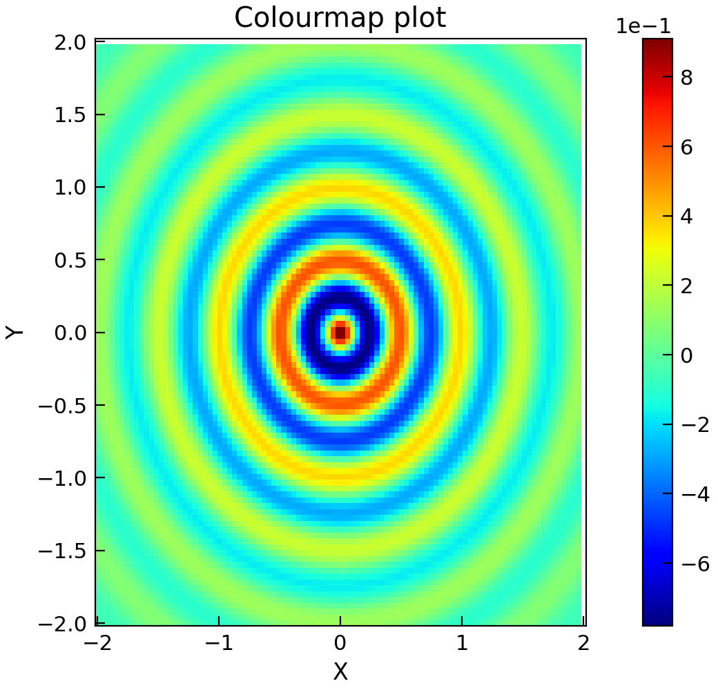
"""Plot 3d fdata as a colourmap."""

import numpy as np

from Stoner import Data

x, y = np.meshgrid(np.linspace(-2, 2, 100), np.linspace(-2, 2, 100))
x = x.ravel()
y = y.ravel()
z = np.cos(4 * np.pi * np.sqrt(x**2 + y**2)) * np.exp(-np.sqrt(x**2 + y**2))

p = Data(np.column_stack((x, y, z)), column_headers=["X", "Y", "Z"])
p.setas = "xyz"

p.colormap_xyz()
p.title = "Colourmap plot"
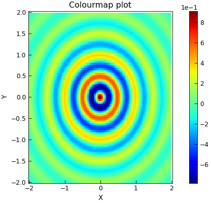
By default the Data.plot_xyz() will produce a 3D surface plot with the z-axis coded with a rainbow colour-map
(specifically, the matplotlib provided matplotlib.cm.jet colour-map. This can be overridden with the cmap keyword
parameter. If a simple 2D surface plot is required, then the plotter parameter should be set to a suitable function
such as pyplot.pcolor.
Like Data.plot_xy(), a figure parameter can be used to control the figure being used and any additional
keywords are passed through to the plotting function. The axes labels are set from the corresponding column labels.
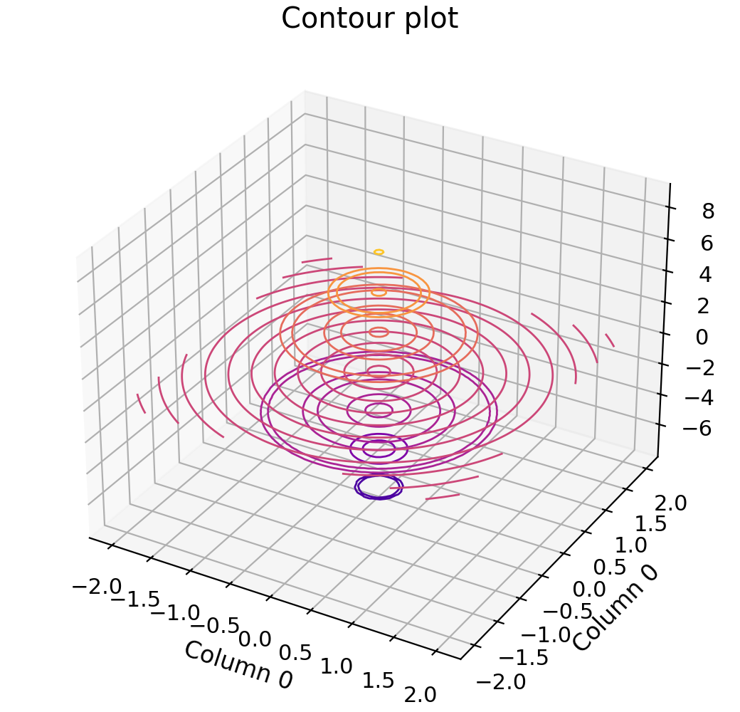
Another option is a contour plot based on (x,y,z) data points. This can be done with the Data.contour_xyz()
method.
"""Plot 3D data on a contour plot."""

import numpy as np

from Stoner import Data

x, y = np.meshgrid(np.linspace(-2, 2, 100), np.linspace(-2, 2, 100))
x = x.ravel()
y = y.ravel()
z = np.cos(4 * np.pi * np.sqrt(x**2 + y**2)) * np.exp(-np.sqrt(x**2 + y**2))

p = Data()
p = p & x & y & z
p.column_headers = ["X", "Y", "Z"]
p.setas = "xyz"

p.contour_xyz()
p.title = "Contour plot"
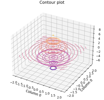
Both Data.plot_xyz() and Data.contour_xyz() make use of a call to Data.griddata()
which is a utility method of the Data – essentially this is just a pass through method to the underlying
scipy.interpolate.griddata* function. The shape of the grid is determined through a combination of the xlim, ylim
and shape arguments.:
X,Y,Z=p.griddata(xcol,ycol,zcol,shape=(100,100))
X,Y,Z=p.griddata(xcol,ycol,zcol,xlim=(-10,10,100),ylim=(-10,10,100))
If a xlim or ylim arguments are provided and are two tuples, then they set the maximum and minimum values of the relevant axis. If they are three tuples, then the third argument is the number of points along that axis and overrides any setting in the shape parameter. If the xlim or ylim parameters are not presents, then the maximum and minimum values of the relevant axis are used. If no shape information is provided, the default is to make the shape a square of sidelength given by the square root of the number of points.
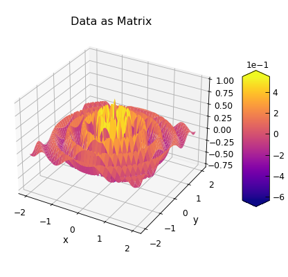
Alternatively, if your data is already in the form of a matrix, you can use the
Data.plot_matrix()method.
"""Plot data defined on a matrix."""

import numpy as np

from Stoner import Data

x, y = np.meshgrid(np.linspace(-2, 2, 101), np.linspace(-2, 2, 101))
z = np.cos(4 * np.pi * np.sqrt(x**2 + y**2)) * np.exp(-np.sqrt(x**2 + y**2))

p = Data()
p = p & np.linspace(-2, 2, 101) & z
p.column_headers = ["X"]
for i, v in enumerate(np.linspace(-2, 2, 101)):
    p.column_headers[i + 1] = str(v)

p.plot_matrix(xlabel="x", ylabel="y", title="Data as Matrix")

The first example just uses all the default values, in which case the matrix is assumed to run from the 2nd column in the
file to the last and over all of the rows. The x values for each row are found from the contents of the first column, and
the y values for each column are found from the column headers interpreted as a floating pint number. The colourmap defaults
to the built in ‘jet’ theme. The x axis label is set to be the column header for the first column, the y axis label is set
either from the meta data item ‘ylabel or to ‘Y Data’. Likewise the z axis label is set from the corresponding metadata
item or defaults to ‘Z Data;. In the second form these parameters are all set explicitly. The xvals parameter can be
either a column index (integer or string) or a list, tuple or numpy array. The yvals parameter can be either a row number
(integer) or list,tuple or numpy array. Other parameters (including plotter, figure etc) work as for the
Data.plot_xyz() method. The rectang parameter is used to select only part of the data array to use as the matrix.
It may be 2-tuple in which case it specifies just the origin as (row,column) or a 4-tuple in which case the third and forth
elements are the number of rows and columns to include. If xvals or yvals specify particular column or rows then the
origin of the matrix is moved to be one column further over and one row further down (ie the matrix is to the right and
below the columns and rows used to generate the x and y data values). The final example illustrates how to generate a
new 2D surface plot in a new window using default matrix setup.
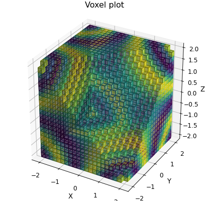
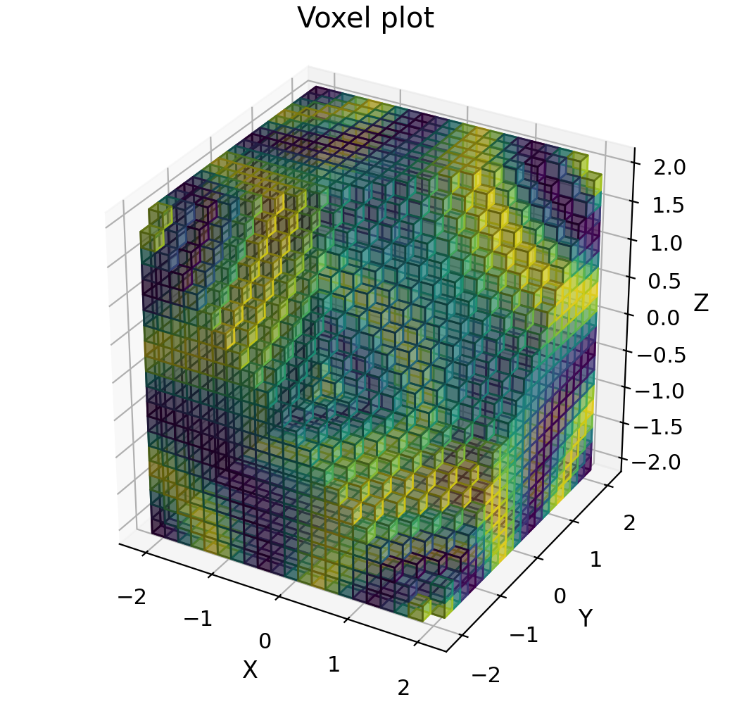
Plotting 3D Scalar Fields
A 3D scalar field is a some \(F(x,y,z)\) where the function returns a scalar value. One option is to plot this as a
volumetric plot where a colour is interpolated over a volume. For this purpose, Data.voxel_plot() is provided.
The function will accept x,y and z column indices for the coordinates (or take them from the Data.setas
attribute) and a fourth, u column index (or the column defined as holding the u data in the Data.setas
attribute). Keyword arguments visible or $filled$ indicate whether a particular voxel will be plotted or not to
allow a cross section of the 3D coordinate space to be show.
"""3D surface plot example."""

import matplotlib.cm
import numpy as np

from Stoner import Data

x, y, z = np.meshgrid(
    np.linspace(-2, 2, 21), np.linspace(-2, 2, 21), np.linspace(-2, 2, 21)
)
x = x.ravel()
y = y.ravel()
z = z.ravel()
u = np.sin(x * y * z)

p = Data(x, y, z, u, setas="xyzu", column_headers=["X", "Y", "Z"])

p.plot_voxels(cmap=matplotlib.cm.jet, visible=lambda x, y, z: x - y + z < 2.0)
p.set_box_aspect((1, 1, 1.0))  # Passing through to the current axes
p.title = "Voxel plot"
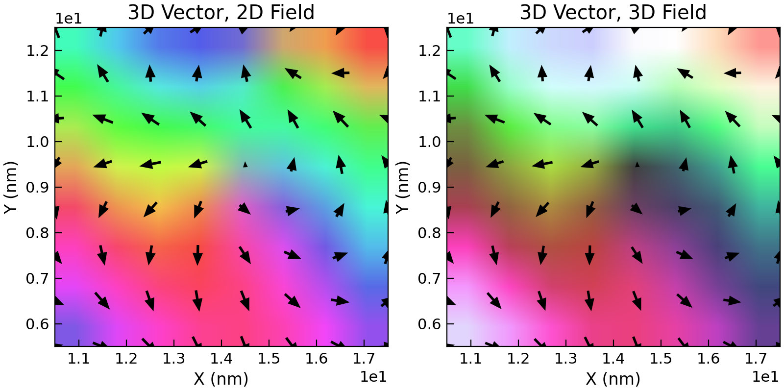
Plotting Vector Fields
For these purposes a vector field is a set of points $(x,y,z)$ at which a 3D vector $(u,v,w)$ is defined. Often vector
fields are visualised by using quiver plots, where a small arrow points in the direction of the vector and whose length
is proportional to the magnitude. This can also be supplemented by colour information - in one scheme a hue-saturation-luminence
space is used, where hue described a direction in the x-y plane, the luminence describes the vertical component and the
saturation, the relative magnitude. This is a common scheme in micro-magnetics, so is supported in the Stoner package.
Following the naming convention above, the Data.plot_xyzuvw() method handles these plots.:
p.plot_xyzuvw(xcol,ycol,zcol,ucol,vcol,wcol)
p.plot_xyzuvw(xcol,ycol,zcol,ucol,vcol,wcol,colors="color_data")
p.plot_xyzuvw(xcol,ycol,zcol,ucol,vcol,wcol,colors=np.random(len(p))
p.plot_xyzuvw(xcol,ycol,zcol,ucol,vcol,wcol,mode='arrow')
p.plot_xyzuvw(xcol,ycol,zcol,ucol,vcol,wcol,mode='arrow',colors=True,scale_factor=1.0)
p.plot_xyzuvw(xcol,ycol,zcol,ucol,vcol,wcol,plotter=myplotfunc)
The Data.plot_xyzuvw() method uses a default vector field plot function that is based on mayavi from
Enthought. The import is done when the plot is required to speed loading times for the Stoner.plot when
2D plotting only is required. If the mayavi package is not available, then matplotlib’s 3D quiver plot is used as a fall back.
The first example above will result in a plot using flat arroiws coloured according to the vector magnitude. The second example will instead color them using the specified column from the data. The third example demonstrates passing in a separate list of colour data. In both of these cases the relative magnitude of the colors data is mapped to a colour map (which can be given via a colormap keyword parameter).
The next example demonstrates changing the glyph used for each data point - in this case to a 3D arrow, but “cone” is also a common choice. In the fifth example, the colors keyword is set to True. This signals the plotting function to colour the individual pints with the H-S-L colour space as described above. The other keyword parameter, scale_factor is passed through (as indeed are any other keyword parameters) to the underlying mayavi.mlab functions. The final example demonstrates the use of the plotter keyword, analogous to the 2D and 3D examples to switch the actual plotting function.
As the mayavi.mlab quiver3d plotting function doesn’t support a title, and axes labels by default, these are not used by default in this function.
As usual, the default operation should still produce reasonable graphs.
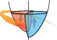
"""Create a 2D vector field plot."""

from os import path

from Stoner import Data, __home__

d = Data(path.join(__home__, "..", "sample-data", "OVF1.ovf"))
e = (
    d.select(Z__between=(10, 11))
    .select(X__between=(10, 18))
    .select(Y__between=(5, 13))
)
e.figure(figsize=(8, 4), no_axes=True)

# 2D vectors on a 2D Field
e.setas = "xy.uv."
e.subplot(121)
e.plot()
e.title = "3D Vector, 2D Field"

# 3D Vector on a 2D Field
e.subplot(122)
e.setas = "xy.uvw"
e.plot()
e.title = "3D Vector, 3D Field"

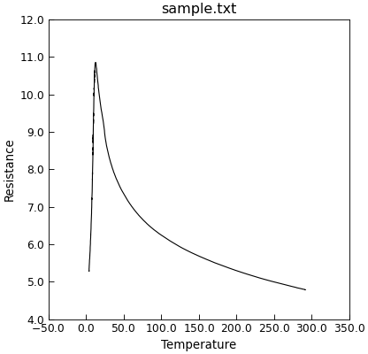
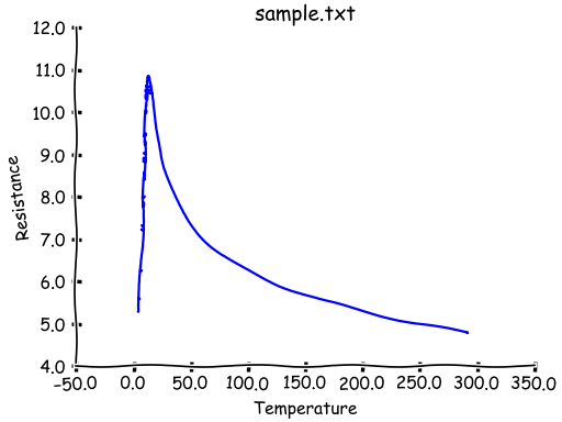
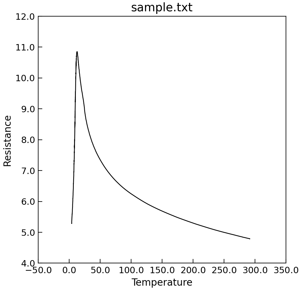
Very Quick Plotting
For convenience, a Data.plot() method is defined that will try to work out the necessary details. In combination
with the Data.setas attribute it allows very quick plots to be constructed.
"""Simple plot in 2 lines."""

from Stoner import Data

p = Data("sample.txt", setas="xy")
# Quick plot
p.plot()
Getting More Control on the Figure
It is useful to be able to get access to the matplotlib figure that is used for each Data instance. The
Data.fig attribute can do this, thus allowing plots from multiple Data instances to be
combined in a single figure.:
p1.plot_xy(0,1,'r-')
p2.plot_xy(0,1,'bo',figure=p1.fig)
Likewise the Data.axes attribute returns the current axes object of the current figure in use by the Data
instance. Data.axes will always return a list of matplotlib.axes.Axes instances, one for each sub-plot on the figure.
There’s a couple of extra methods that just pass through to the pyplot equivalents:
p.draw()
p.show()
Setting Axes Labels, Plot Titles and Legends
Data provides some useful attributes for setting specific aspects of the figures. Any
get_ and set_ method of matplotlib.pyplot.Axes or matplotlib.pyplot.Figure can be read or
written as a Data attribute.
Internally this is implemented by calling the corresponding method on the current axes or fgiure of the Data
instance. When setting the attribute, lists and tuples will be assumed to contain positional arguments and dictionaries
keyword arguments. If you want to pass a single tuple, list or dictionary, then you should wrap it in a single
element tuple.
Particularly useful attributes include:
Data.xlabel,Data.ylabelwill set the x and y axes labelsData.titlewill set the plot titleData.xlim,Data.ylimwill accept a tuple to set the x- and y-axes limits.Data.labelssets a list of strings that are the preferred name for each column. This is toallow the plotting routines to provide a default name for an axis label that can be different from the name of the column used for indexing purposes. If the label for a column is not set, then the column header is used instead. If a column header is changed, then the
Data.labelsattribute will be overwritten.
In addition, you can read any function of matplotlib.pyplot, or method of matplotlib.pyplot.Axes, or
matplotlib.pyplot.Figure as an attribute of Data. This allows one to call the methods directly on
the Data instance without needing to extract a reference to the current axes or figure.:
p.xlabel="My X Axis"
p.set_xlabel("My X Axis")
are both equivalent, but the latter form allows access to the full keyword arguments of the x axis label control.
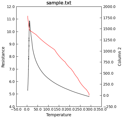
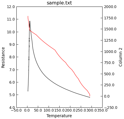
Plotting on Second Y (or X) Axes
To plot a second curve using the same x axis, but a different y axis scale, the Data.y2() method is
provided. This produces a second axes object with a common x-axis, but independent y-axis on the right of the plot.
"""Plot data using two y-axes."""

from Stoner import Data

p = Data("sample.txt", setas="xyy")
p.plot_xy(0, 1, "k-")
p.y2()
p.plot_xy(0, 2, "r-")

There is an equivalent Data.x2() method to create a second set of axes with a common y scale but different x scales.
To work out which set of axes you are current working with the Data.ax attribute can be read or set.:
p.plot_xy(0,1)
p.y2()
p.plot_xy(0,2)
p.ax=0 # Set back to first x,y1 plot
p.label="Plot 1"
p.ax=1 # Set to the second
p.yabel="Plot 2"
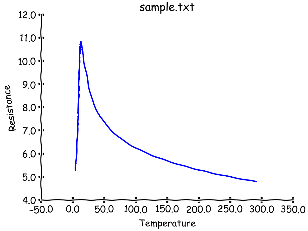
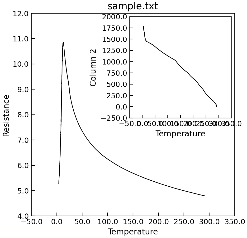
Plot Templates
Frequently one wishes to create many plots that have a similar set of formatting options - for example
in a thesis or to conform to a journal’s specifications. The Stoner.plot.formats in conjunctions with
the Data.template attribute can help here.
A Data.template template is a set of instructions that controls the default settings for many
aspects of a matplotlib figure’s style. In addition the template allows for pyplot formatting commands to be
executed during the process of plotting a figure.
"""Customising a template for plotting."""

from Stoner import Data
from Stoner.plot.formats import SketchPlot

p = Data("sample.txt", setas="xy", template=SketchPlot)
p.plot()
The template can either be set by passing a subclass of Stoner.plot.formats.DefaultPlotStyle or
a particular instance of such a subclass. This latter option allows you to override the default plot attribute
settings defined by the template class with your own choice - or indeed, to add further style attributes. This
can be done by either calling the template and passing it arguments as keywords, or by settiong attributes directly on the template.
Because the matplotlib rcParams dictionary has keys that are not valid Python identifiers, periods in the rcParams keys
are translated as underscores and thus underscores become double underscores. When setting attributes on the template directly,
prefix the translated rcParam key with template_.
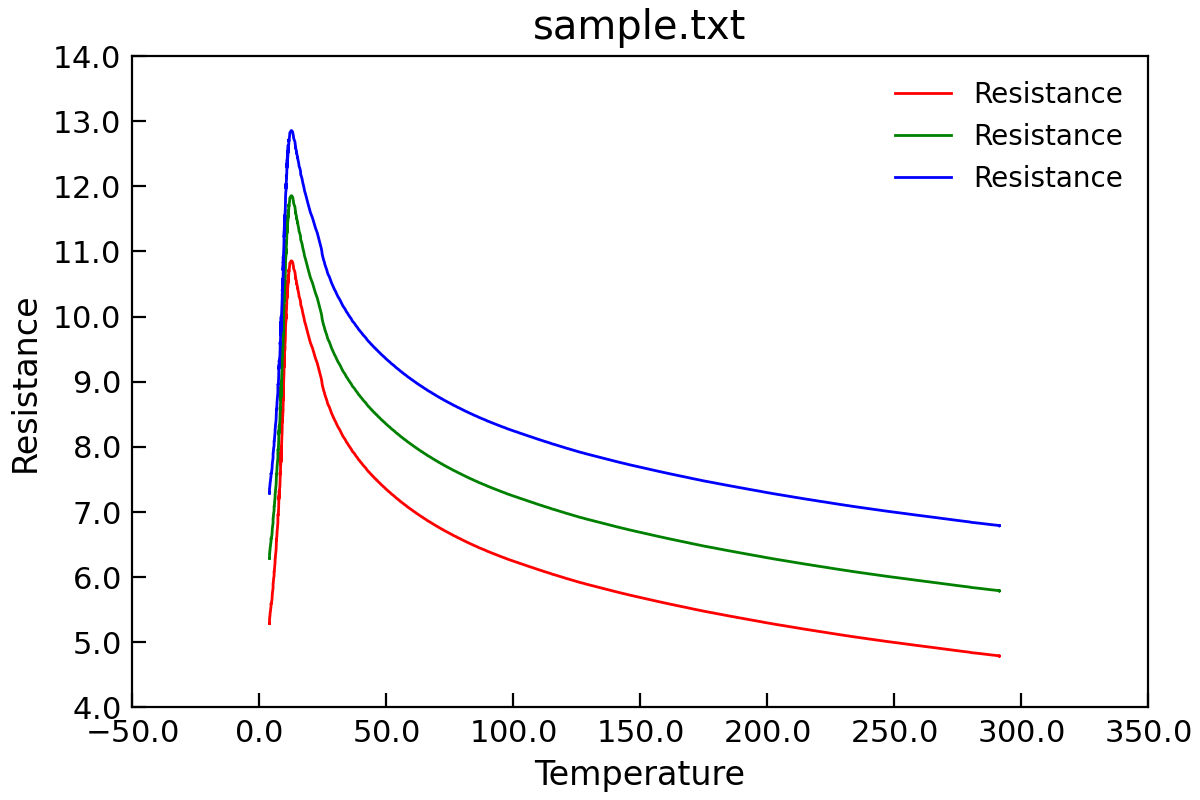
"""Simple plotting with a template."""

from cycler import cycler

from Stoner import Data
from Stoner.plot.formats import DefaultPlotStyle

p = Data("sample.txt", setas="xy", template=DefaultPlotStyle())
p.template(
    axes__prop_cycle=cycler("color", ["r", "g", "b"])
)
p.plot()
p.y += 1.0
p.plot()
p.y += 1.0
p.plot()

You can also copy the style template from one plot to the next.
q=Data() q.template=p.template
Matplotlib makes use of stylesheets - essentially separate files of matplotlibrc entries. The template classes have a stylename
parameter that controls which stylesheet is used. This can be either one of the built in styles (see matplotlib.pyplot.styles.available)
or refer to a file on disc. The template will search for the file (named <stylename>.mplstyle) in.
the same directory as the template class file is,
a subdirectory called stylelib of the directory where the template class file is or,
the stylelib subfolder of the Stoner package directory.
Where a template class is a subclass of the DefaultPlotStyle, the stylesheets are inherited in the same order as the
class hierarchy.
Changing the value of Lpy:attr:DefaultPlotStyle.stylename will force the template to recalculate the stylesheet hierarchy, refidning the paths to the stylesheets. You can also do any in-place modifications to the template stylesheet list (e.g. appending or extending it).
Further customisation is possible by creating a subclass of DefaultPlotStyle and overriding the
DefaultPlotStyle.customise() method and DefaultPlotStyle.customise_axes() method.
One-off changes in the template can also be done. The DefaultPlotStyle behaves like a dictionary - the keys of the dictionary
correspond to settings of the matplotlib.RcParams. Reading the keys of the DefaultPlotStyle returns the current settings,
setting them changes the underlying matplotlib.RcParams and deleting them resets the settings back to defaults. The
DefaultPlotStyle otherwise behaves like a standard mutable-mapping object, supporting the expected methods such as get, pop,
keys, values etc. It is also possible to access the settings as attributes of the template except that they are prefixed with template_ and
periods ‘.’ are replced with double underscores ‘__’.
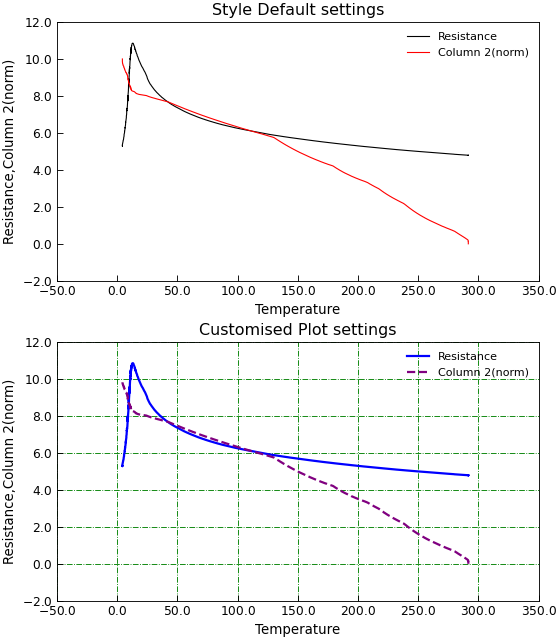
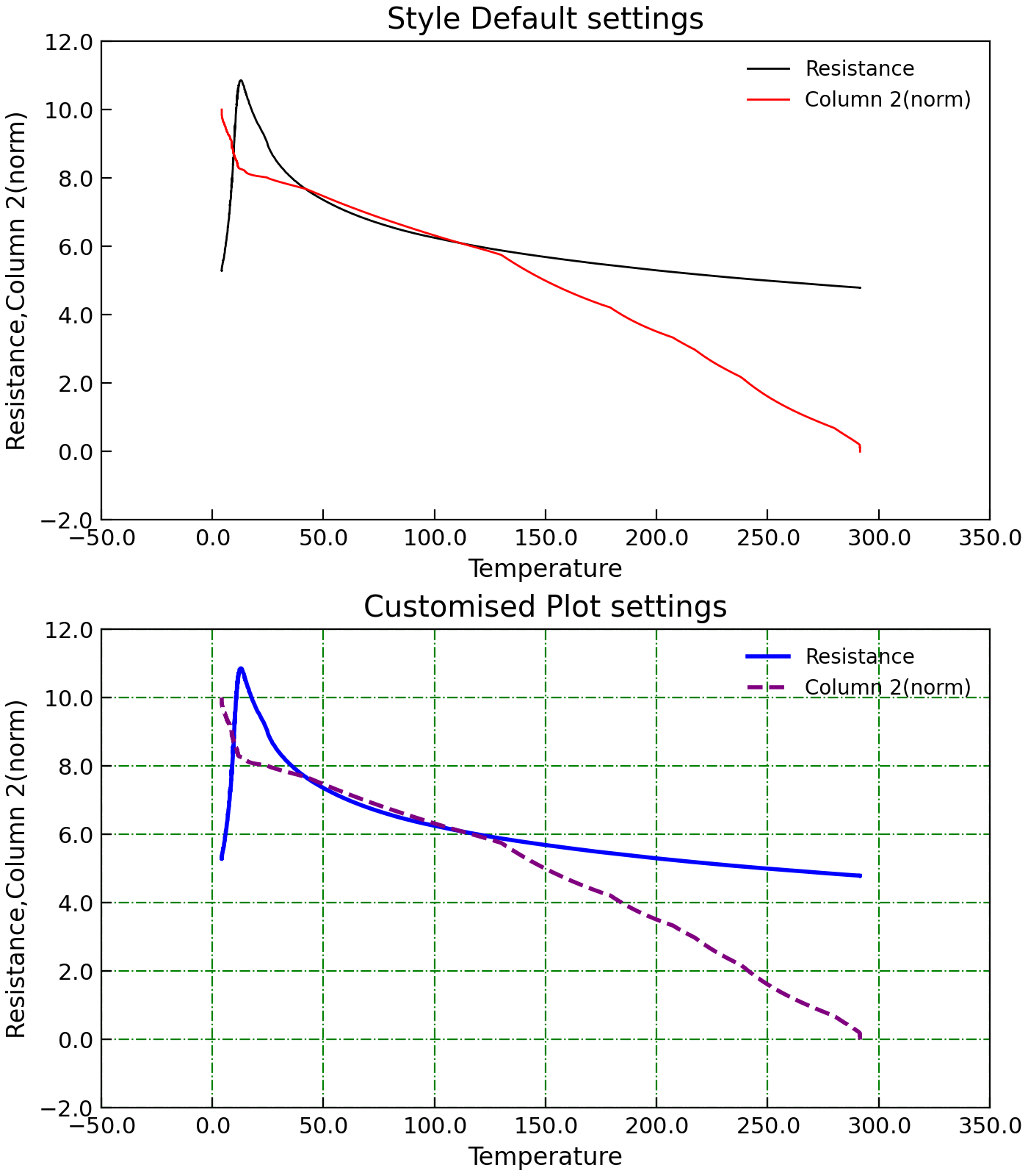
"""Example customising a plot using default style."""

import os.path as path

from cycler import cycler

from Stoner import Data, __home__
from Stoner.plot.formats import DefaultPlotStyle

filename = path.realpath(
    path.join(__home__, "..", "doc", "samples", "sample.txt")
)

d = Data(filename, setas="xyy", template=DefaultPlotStyle)
d.normalise(2, scale=(0.0, 10.0))  # Just to keep the plot sane!

# Change the color and line style cycles
d.template["axes.prop_cycle"] = cycler(color=["Blue", "Purple"]) + cycler(
    linestyle=["-", "--"]
)

# Can also access as an attribute
d.template.template_lines__linewidth = 2.0

# Set the default figure size
d.template["figure.figsize"] = (6, 8)
d.template["figure.autolayout"] = True
# Make figure (before using subplot method) and select first subplot
d.figure(no_axes=True)
d.subplot(212)
# Pkot with our customised defaults
d.plot()
d.grid(True, color="green", linestyle="-.")
d.title = "Customised Plot settings"
# Reset the template to defaults and switch to next subplot
d.template.clear()
d.subplot(211)
# Plot with defaults
d.plot()
d.title = "Style Default settings"
# Fixup layout
d.figwidth = 7  # Magic pass through attribute access
The seaborn package offers many options for producing visually appealing plots with a higher level abstraction of the matplotlib api/
The SeabornPlotStyle template class offers a quick interface to using this. It takes attributes SeabornPlotStyle.stylename,
SeabornPlotStyle.context and SeabornPlotStyle.palette to set the corresponding seaborn settings.
Making Multi-plot Figures
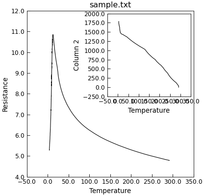
Adding an Inset to a Figure
The Data.inset() method can be used to creagte an inset in the current figure. Subsequent plots
will be to the inset until a new set of axes are chosen. The pyplot.Axes instance of the inset is appended to the
Data.axes attribute.
"""Add an inset to a plot."""

from Stoner import Data

p = Data("sample.txt", setas="xy")
p.plot()
p.inset(loc=1, width="50%", height="50%")
p.setas = "x.y"
p.plot()
p.title = ""  # Turn off the inset title

The loc parameter specifies the location of the inset, the width and height the size (either as a percentage or fixed units). There is an optional parent keyword that lets you specify an alternative parent set of axes for the inset.
loc = 1 top-right inset
loc = 2 top left inset
loc = 3 bottom left inset
loc = 4 bottom right inset
loc = 5 mid-right inset
loc = 6 mid-left inset
loc = 7 mid-right inset
loc = 8 mid-bottom inset
loc = 9 mid-top inset
loc = 0 centre inset
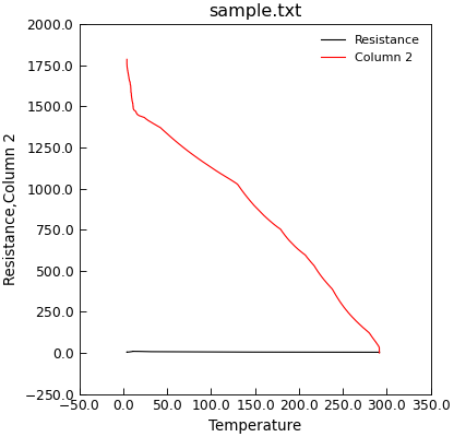
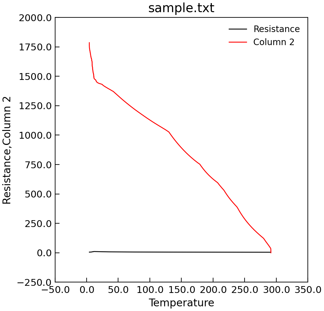
Handling More than One Column of Y Data
By default if Data.plot_xy() is given more than one column of y data, it will plot all
of the data on a single y-axis scale. If the y data to be plotted is not of a similar order of mangitude
this can result in a less than helpful plot.
"""Plot data on a single y-axis."""

from Stoner import Data

p = Data("sample.txt", setas="xyy")
# Quick plot
p.plot()
The Data.plot_xy() method (and also the Data.plot() method when doing 2D plots) will take
a keyword argument multiple that can offer a number of alternatives. If you have just two y columns, or the the
second and subsequent ones can fit on a common scale, then a double-y axis plot might be appropriate.
"""Double y axis plot."""

from Stoner import Data

p = Data("sample.txt", setas="xyy")
# Quick plot
p.plot(multiple="y2")

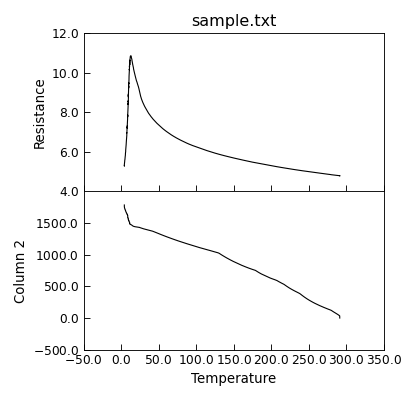
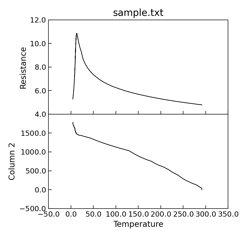
Alternatively, if you want the various y plots to form multiple panels with a common x-axis (a ganged plot) then multiple can be set of panels.
"""Plot data using multiple sub-plots."""

from Stoner import Data

p = Data("sample.txt", setas="xyy")
# Quick plot
p.plot(multiple="panels")
# Helps to fix layout !
p.set_layout_engine("tight")
p.draw()
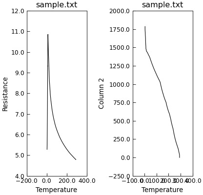
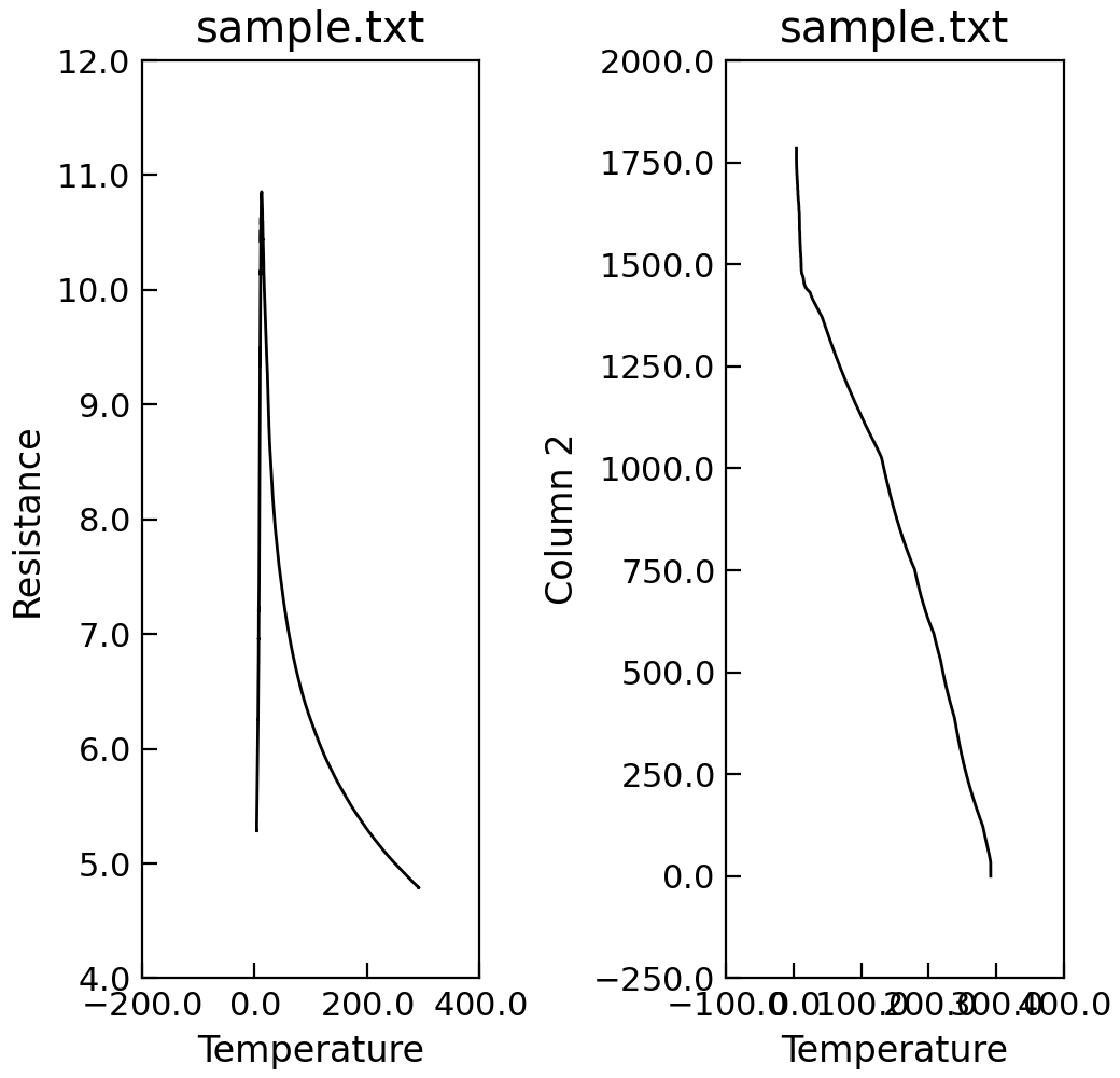
Finally, you can also simply plot the y data as a grid of independent subplots.
"""Independent sub plots for multiple y data."""

from Stoner import Data

p = Data("sample.txt", setas="xyy")
# Quick plot
p.plot(multiple="subplots")
